Grid systems and custom functions
In graphic design, a grid is a structure (usually two-dimensional) made up of a series of intersecting straight (vertical, horizontal, and angular) or curved guide lines used to structure content. The grid serves as an armature on which a designer can organize graphic elements (images, glyphs, paragraphs) in a rational, easy to absorb manner. A grid can be use to organize graphic elements in relation to a page, in relation to other graphic elements on the page, or relation to other parts of the same graphic element or shape. 1
In web design, a grid system is a tool to add order to the chaos of the layout of a web page. The general rules for grid apply with an added dimension of responsiveness to the changing dimensions of a web page. With the grid the page is divided into the determined division components, a 12 or 16 column layout, which will allow for the proper layout of the web page. Each column in the layout will also have an associated gutter, a space between each column, is attached to it. There are two types of grid layout:
- Fixed: In a fixed grid layout, the parent layout has a fixed width of
960pxor1024pxfor example. All columns within this parent layout will have either a percentage value or a fixed value. - Fluid: The difference between fixed and fluid is the fact that the parent layout will have a percentage value in a fluid layout vs. a fixed value in a fixed layout. This fluidity of the grid allows for handling of all the different dimensions that are confronted by web designers and developers, ranging from small devices like a smart-phone to a large display on a big screen or TV.
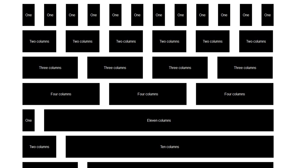
A typical grid system template looks something like this:
In order to create this grid system, we need to make some calculations in order to come up with the variety of values needed for all the different situations and that is where Sass and the ability to create the necessary custom functions. Let's take a look at how Thoughbot create this grid system in their framework of Bourbon Neat.
Bourbon Neat Functions
In the implementation of the grid system in Bourbon Neat, the following variables have been set in the _grid.scss file:
$column: golden-ratio(1em, 3) !default; // Column width
$gutter: golden-ratio(1em, 1) !default; // Gutter between each two columns
$grid-columns: 12 !default; // Total number of columns in the grid
$max-width: em(1088) !default; // Max-width of the outer container
$border-box-sizing: true !default; // Makes all elements have a border-box layout
$default-feature: min-width; // Default @media feature for the breakpoint() mixin
$default-layout-direction: LTR !default;
The functions that do the majority of the calculations for grid system are in the _private.scss file:
$parent-columns: $grid-columns !default;
$fg-column: $column;
$fg-gutter: $gutter;
$fg-max-columns: $grid-columns;
$container-display-table: false !default;
$layout-direction: nil !default;

@function flex-grid($columns, $container-columns: $fg-max-columns) {
  $width: $columns * $fg-column + ($columns - 1) * $fg-gutter;
  $container-width: $container-columns * $fg-column + ($container-columns - 1) * $fg-gutter;
  @return percentage($width / $container-width);
}

@function flex-gutter($container-columns: $fg-max-columns, $gutter: $fg-gutter) {
  $container-width: $container-columns * $fg-column + ($container-columns - 1) * $fg-gutter;
  @return percentage($gutter / $container-width);
}

@function grid-width($n) {
  @return $n * $gw-column + ($n - 1) * $gw-gutter;
}

@function get-parent-columns($columns) {
  @if $columns != $grid-columns {
    $parent-columns: $columns !global;
  } @else {
    $parent-columns: $grid-columns !global;
  }

  @return $parent-columns;
}

@function is-display-table($container-is-display-table, $display) {
  $display-table: false;

  @if $container-is-display-table == true {
    $display-table: true;
  } @else if $display == table {
    $display-table: true;
  }

  @return $display-table;
}
Let's look at one these functions in detail. The flex-grid function calculates the percentage value of each column based on the number of columns and the gutter width.
@function flex-grid($columns, $container-columns: $fg-max-columns) {
  $width: $columns * $fg-column + ($columns - 1) * $fg-gutter;
  $container-width: $container-columns * $fg-column + ($container-columns - 1) * $fg-gutter;
  @return percentage($width / $container-width);
}
In this functions the parameters passed are $columns which is the number of columns that the desired element will be spanning. The value of $container-columns is optional which if not passed will be the value of $fg-max-column which is 12. In the function, one of the first calculations that happen is to calculate the width of the columns and the container columns. In order to do that, the following calculation is done:
$width: $columns * $fg-column + ($columns - 1) * $fg-gutter;
$container-width: $container-columns * $fg-column + ($container-columns - 1) * $fg-gutter;
$columnsis the value passed to the function.$fg-columnis the value of the variable of $column which itself is the value of the calculation of golden-ratio(1em, 3). For more details on the golden-ratio function go to https://github.com/thoughtbot/bourbon/blob/master/app/assets/stylesheets/functions/_golden-ratio.scss and https://github.com/thoughtbot/bourbon/blob/master/app/assets/stylesheets/functions/_modular-scale.scss- we also add the width the size of the gutter which equals to the number of
$columnsminus one (because we do not add gutters to all the columns) multiplied by the size of the gutter,$fg-gutter value.
the returned value of this function is the ratio of spanning columns to the total number of columns in the parent element represented in percentage. This function is used in the mixin named span-columns2
@mixin span-columns($span: $columns of $container-columns, $display: block) {
  $columns: nth($span, 1);
  $container-columns: container-span($span);

  // Set nesting context (used by shift())
  $parent-columns: get-parent-columns($container-columns) !global;

  $direction: get-direction($layout-direction, $default-layout-direction);
  $opposite-direction: get-opposite-direction($direction);

  $display-table: is-display-table($container-display-table, $display);

  @if $display-table  {
    display: table-cell;
    width: percentage($columns / $container-columns);
  } @else {
    float: #{$opposite-direction};

    @if $display != no-display {
      display: block;
    }

    @if $display == collapse {
      @warn "The 'collapse' argument will be deprecated. Use 'block-collapse' instead."
    }

    @if $display == collapse or $display == block-collapse {
      width: flex-grid($columns, $container-columns) + flex-gutter($container-columns);

      &:last-child {
        width: flex-grid($columns, $container-columns);
      }

    } @else {
      margin-#{$direction}: flex-gutter($container-columns);
      width: flex-grid($columns, $container-columns);

      &:last-child {
        margin-#{$direction}: 0;
      }
    }
  }
}
Functions and mixins are powerful tools in Sass. However sometimes the use of one over the other is confused and the mistake is that instead of abstraction, we have a tendency of putting logic in mixins where they belong in a function or vice versa. Let's examine the proper time to use a function and the proper time to use a mixin.